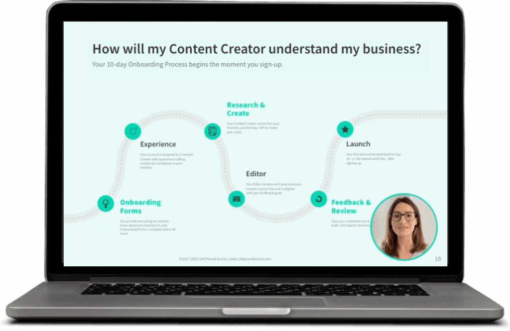

Why Does Your Call to Action Matter?
The call to action is arguably the most important, yet most overlooked aspect of any marketing message. It’s also the difference between losing a potential customer and making a sale.
First, let’s look at what a CTA actually is…
What is a Call to Action?
Call to actions are those buttons, links, and images that you want your users to click on in order to get them to shop, buy, upgrade, sign up, and so on.
Without a good CTA, chances are your site will probably not convert very well!
The purpose of a CTA is to tell your visitors what to do next, i.e:
- Make a purchase
- Sign up for a service
- Share feedback
- Sign up for a mailing list
You might think it’s obvious, but to a visitor to your site there are usually many things to look on a webpage and interact with – inviting them to read more, sign up for a newsletter, request a demo, give feedback, etc.
Creating the Perfect CTA
Here are some tips to create a perfect call to action – both the CTA button itself and the text used for it. Remember, you can also re-use the CTA text within your wider social media or digital marketing strategy.
Make it Stand Out
Sometimes, it can be easy to miss a call to action because it simply doesn’t stand out. Play with the colours and font styling so your call to action attracts the attention it deserves. Also remember to use white space effectively, as this will make your CTA button stand out.
Make it Mobile Friendly
Optimising the CTA button for mobile is very important nowadays as you’ll be surprised how many of your visitors are on mobile. Statistics show that mobile browsing accounts for approximately half of web traffic worldwide.
Make it Clear and Simple
Wording matters. It’s important to make every word clear so the audience fully understands what they need to do next. For example: “Contact Us” is a far more efficient call to action than “Contact Details.”
Even if the intention is implied, it is always safer to make it abundantly clear what will happen when the user clicks on the button.
Use an Action Verb
Action verbs are exciting. Use them whenever possible to guide users where you want them to go. “Learn more” is far more exciting than “More information.” By using action verbs, you will get your visitors involved and engaged towards becoming a lead or making a purchase.

Add Urgency
Sometimes, we need a little nudge to do what we’re told. Time-related words such as “Now” or “Today” can be effective for increasing conversions. Combined with action verbs, they provide immediacy. Examples include: “Start your free trial now” or “Contact us today for a free consultation”
If you have a special offer going on or have limited stock left, you can create urgency by highlighting these.
This type of urgency creates a fear of missing out – encouraging users to act immediately. These should be used sparingly and strategically.
Be careful not to add too much urgency – if it looks like your website is designed to force a sale, your prospects may have second thoughts about doing business with your brand.
Reduce Risk
Think about some objections your customer may have. You can address these concerns directly in your call to action.
“They may ask for my credit card when I sign up” – Start your free trial, no credit card required
“They are going to sell to me if I book a demo” – Book a free consultation, no strings attached.
Small text that addresses your prospect’s initial objections can go a long way towards increasing conversions.
Keep Your Calls to Action Consistent
If you use a call to action multiple times on a page (and it is good practice to) – it’s important to keep them consistent. This allows users to easily recognise the call to action throughout the page.
Consistent calls to action use the same text, colours, and styling.
Limit Yourself to a Maximum of 2 Calls to Action Per Page
Think about this question: “After visiting this page, what is the one thing that I would want a user to do?”
The answer to this question should be your primary call to action. The only exception to this would be ecommerce “Add-to-Cart” buttons.
Sometimes, users may need a little more information before they can accomplish the one thing you’d like them to. In such cases, a secondary call to action (with less emphasis) could help boost conversions.
For example, a SaaS platform could have the following primary call to action:
“Get started today for free”
A secondary call to action could be “Request demo.” In this case, the demo helps the user get a better idea of what they are signing up for. With enough information, the primary CTA soon becomes a no-brainer.
Final Words
With these steps, we hope your calls to action are crisp, clear, and converting.
However, it may be possible that some website visitors show high interest, but still don’t convert. In such cases, it may be easier to use a B2B Website Lead Identification Tool.
Thank you to Happierleads for sharing this guest post with us! Happierleads help 2000+ companies identify their B2B website visitors – generating 3X more leads than the competition using existing web traffic.